How to Present a Moodboard and Get Creative Direction Approved
Learn how to present moodboards to clients clearly, pitch your visual ideas with confidence, and avoid painful revisions throughout the project.

Sending a folder full of loose images to a client is an open invitation for conflicting feedback and second-guessing. When you turn a moodboard into a well-crafted visual narrative, it stops looking like a random collage and becomes the solid foundation that sells your vision before you even touch the final design.
The biggest mistake when sharing references with clients
Many creative pros make the mistake of building a stunning board, exporting a file, and emailing it over with a vague: "What do you think?". That generic question practically invites the client to judge every single element through their own personal taste, rather than evaluating the project's strategy.
The client spots an image with earthy tones and declares they hate brown, or glances at a model and decides they dislike her haircut. But a moodboard is never about getting sign-off on individual assets; it’s about aligning on the overall atmosphere, energy, and visual pillars that will guide everything moving forward.
To cut through that noise, you have to frame the conversation. Before showing a single image, remind them of their business goals, the target audience, and the emotions the project needs to evoke. The board should feel like the natural visual answer to those strategic challenges.
The anatomy of a moodboard built to persuade
An effective presentation board needs hierarchy and focus. Rather than crowding dozens of similar references together, curate a handful of strong elements that reflect different layers of the visual experience:
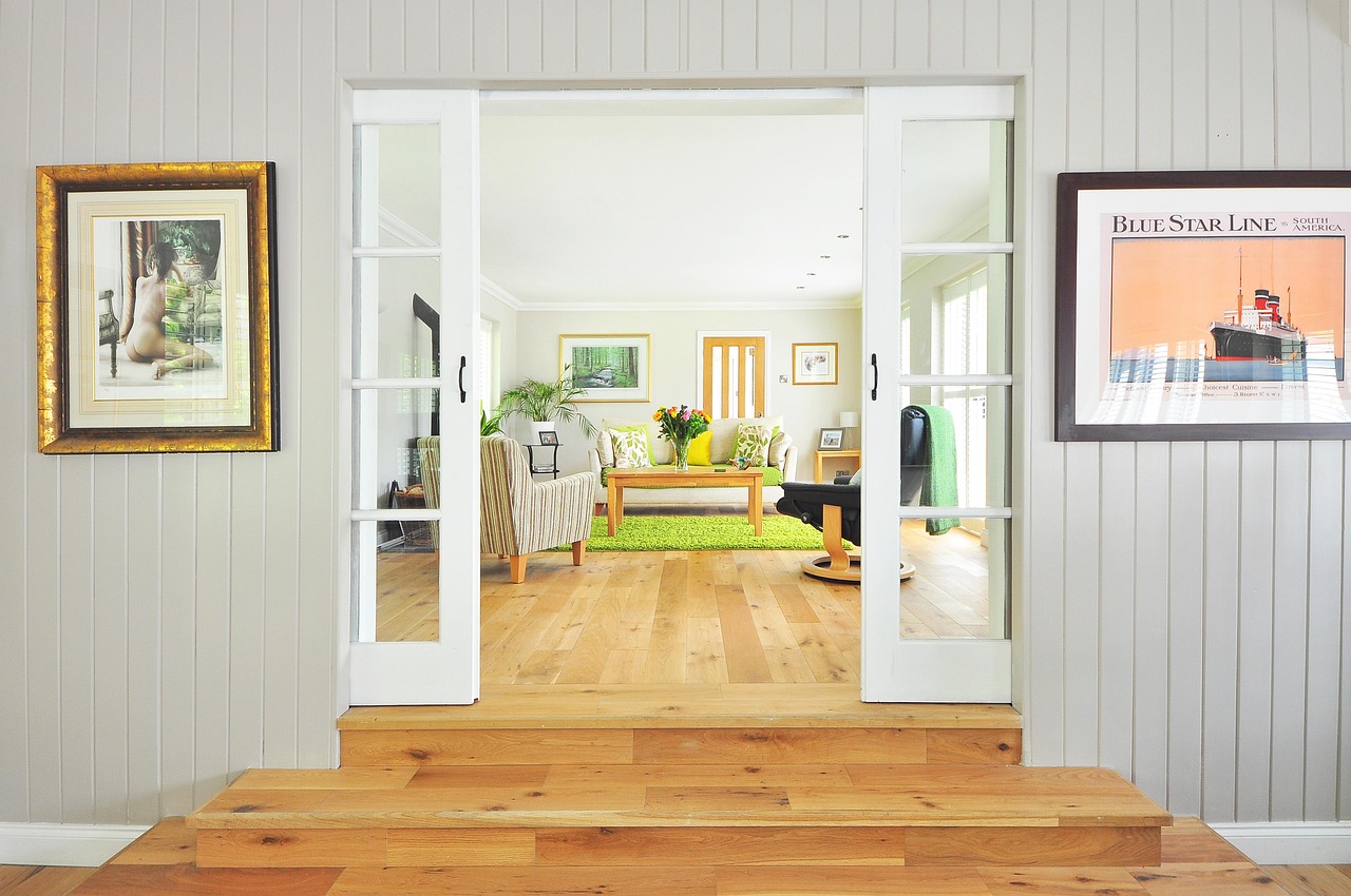
- The visual anchor: one or two dominant images that encapsulate the core mood of the brand or campaign (such as an airy, quiet interior conveying calm, or a dynamic crop radiating urban energy).
- Texture and materiality: tactile details like raw wood, soft lighting, glass, vellum paper, or film grain. This helps the client feel the tactile world of the project beyond just color.
- Typographic direction: font specimens shown in context, displaying contrasts in weight, elegance, or casual charm.
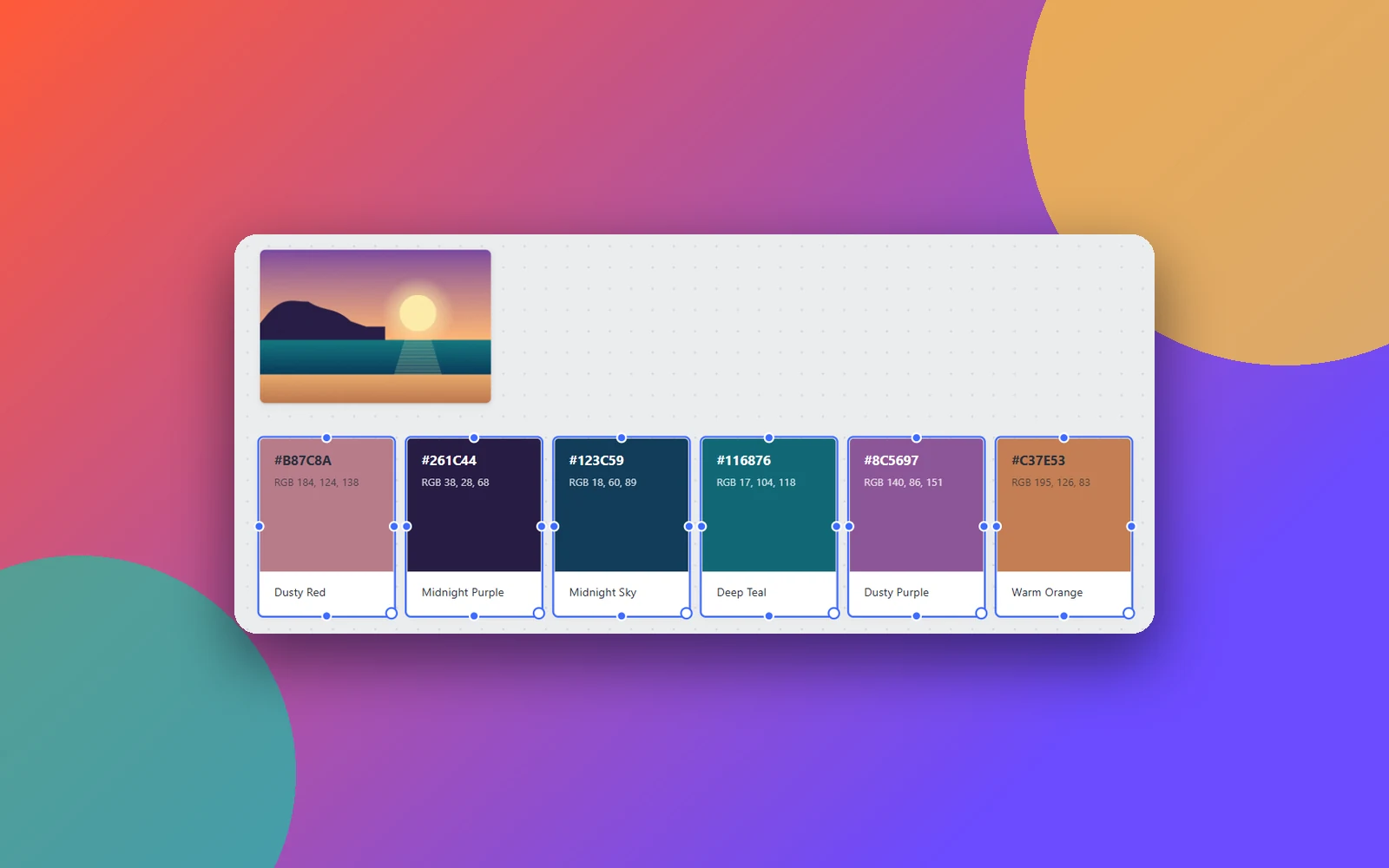
- Applied color palette: distinct color swatches displaying primary and secondary tones working together in harmony.
- Photographic style: examples of framing, lighting, and art direction that show how real project photography should look and feel.

How to run the presentation meeting step by step
If you want to sell your creative direction smoothly, present the board live—whether via video call or in person. Your voice brings context and deliberate intention to every visual choice.
1. Start with verbal alignment
Open the conversation by recapping the brief with three or four agreed-upon keywords or strategic goals. Say something like: "We agreed the brand identity should feel unpretentiously sophisticated, welcoming, and clear. Keep those three words in mind as we walk through the material."
2. Walk through the board step by step
Instead of unveiling the entire board all at once and waiting for an instant reaction, tell the story behind the composition. Explain why specific lighting was chosen, how the color palette connects with the company’s positioning, and how the texture rhythm reflects the brand’s tone of voice.
A well-presented moodboard doesn't ask for permission to have good taste; it teaches the client how to see the soul of the project.
3. Ask the right questions
Swap open-ended prompts for targeted questions. Instead of asking if they like it, try:
- "Does this visual world capture the modern feel we discussed last week?"
- "Do you feel your target audience would connect with this welcoming atmosphere?"
- "Is there any element here that clashes with the goals we set?"
Questions like these guide the client to view the work through a business and strategic lens, shielding your direction from purely subjective whims.
How to document approvals and prevent future rework
Verbal approvals left undocumented are a recipe for painful rework. As soon as the call wraps up and you've reached an agreement, formalize the key takeaways in writing so they serve as a compass for the next phase.
Write a brief summary highlighting the approved pillars: the signed-off color palette, the chosen photographic style, and any specific tweaks agreed upon (like softening contrast or avoiding certain font styles). Sharing this follow-up ensures everyone stays aligned as production begins on actual layouts and final assets.
What to do when a client asks for two concept options
Offering two distinct visual routes is common practice and often helpful for brands going through a transition. However, avoid generating artificial options just to inflate volume. Each concept must answer a legitimate angle of the creative brief.
For example, in a rebranding project, Route A might explore a classic, refined approach, while Route B takes a bolder, contemporary direction. Give each board a conceptual title (like "Organic Serenity" vs. "Urban Impact") and present them one at a time. When concepts have clear identities, the client’s decision shifts from overwhelming doubt to an exciting, deliberate choice for their business's future.
Actionable next step
Before your next client presentation, open your workspace, narrow down to the ten strongest references for your concept, and write a single sentence next to each cluster explaining the rationale behind it. Practice your walkthrough out loud for three minutes, keeping the focus entirely on solving the client's problem. You’ll be surprised at how that extra clarity and confidence completely transforms the outcome.
Cover photo: Darkmoon_Art · Pixabay.